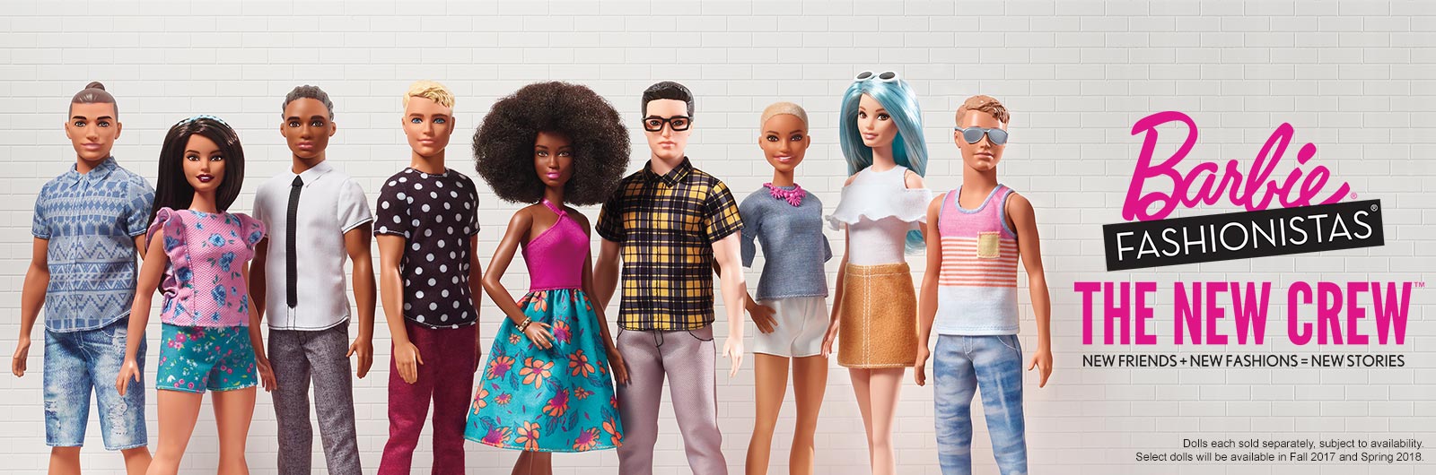
Barbie was launching new face sculpts, new skin tones, and new body shapes. My challenge was how do we:
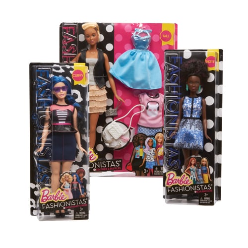
1. Communicate body shape on the package
2. Make the package design stand out on the shelf
3. Make it collectible
My role was as a Manager of Barbie packaging, working with my art director, copywriter, and engineer, to figure out not just how to make the dolls look good but how to communicate such a delicate matter of body shape. It was a huge project that included PR, the brand team, and even the President of Mattel. The end result looks simple but it was many decisions that made it work seamlessly.
Luckily, the brand team were early adopters and helped with the photoshoots and messaging. However, my job was to collaborate with the brand team on how this package design was going to look.
What would be disruptive yet inclusive?
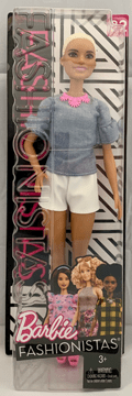
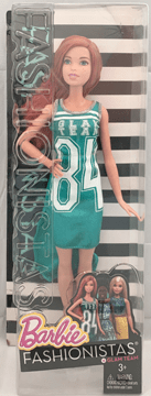
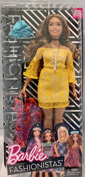
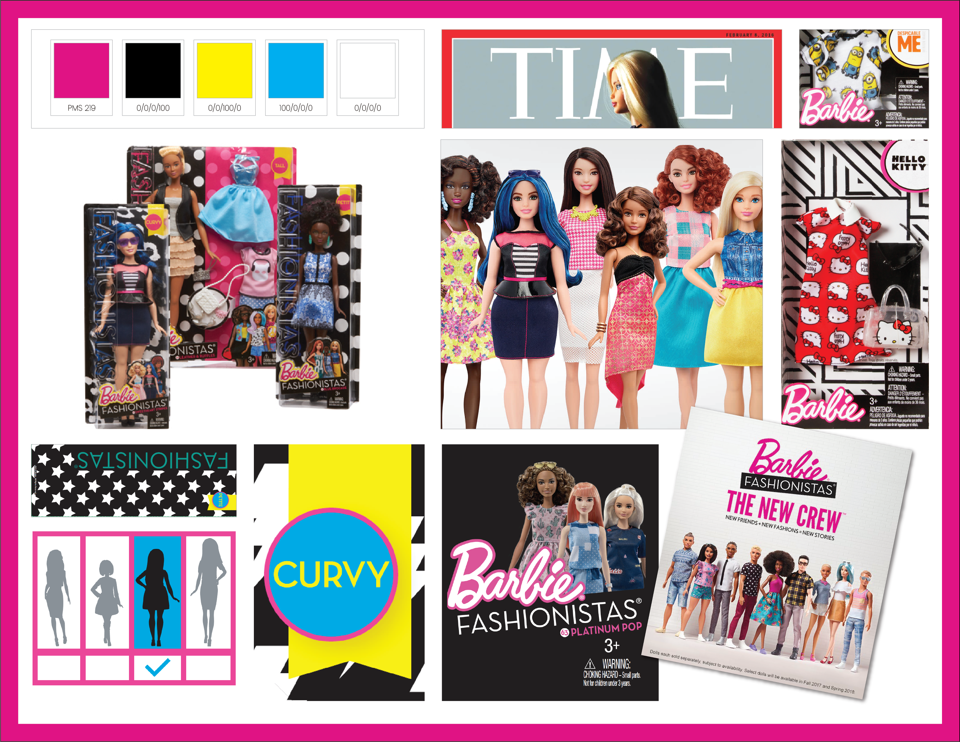
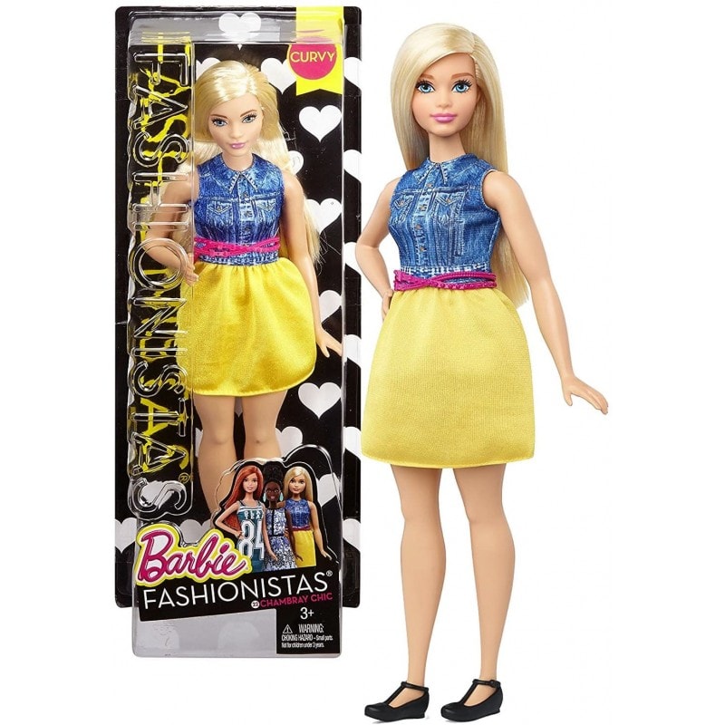
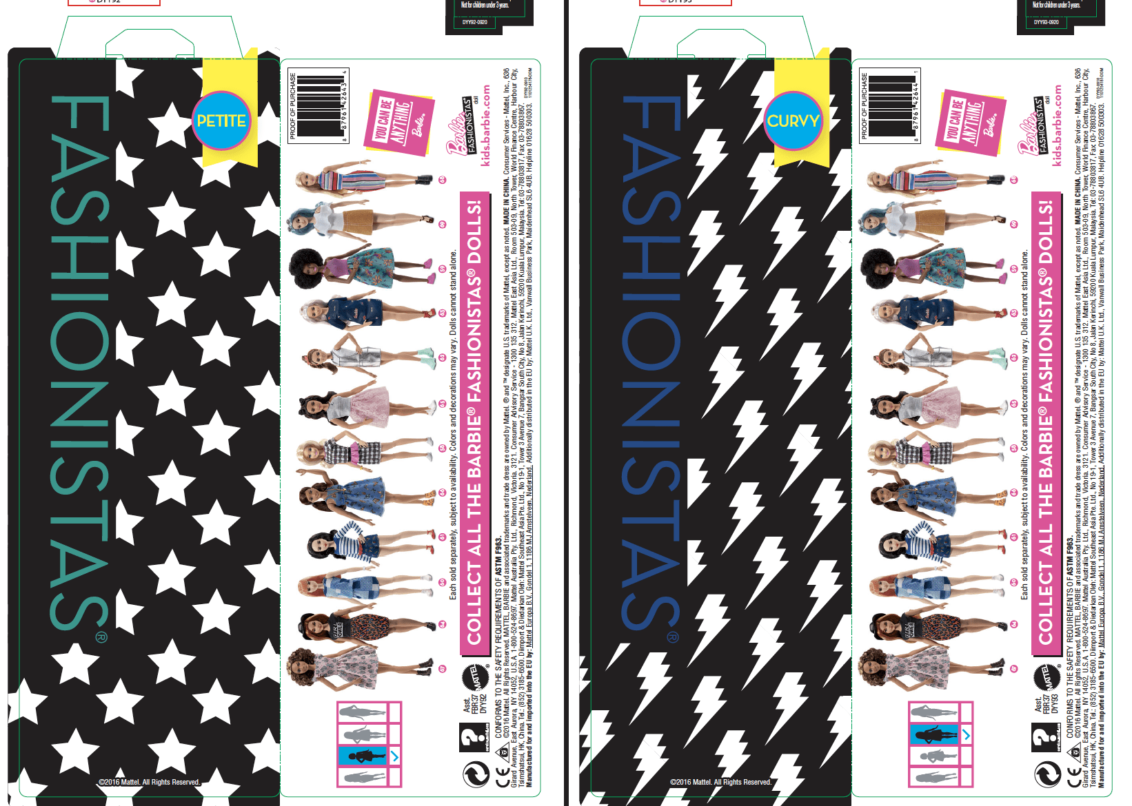
I remembered at my previous job when we redesigned store label Albertsons brands, there was so much color on the shelf that we went pure white with a hint of color to help break up the shelf and draw attention to our product. We employed the same tactic here but with a simple black and white palette. Each doll got her own pattern, name, and number.
My art director had probably 10 different options for the background design and we ended up using all of them on the early dolls. The copywriter was so clever in coming up with names like “Platinum Pop” and “Denim & Dazzle.”
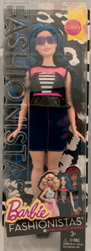
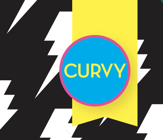
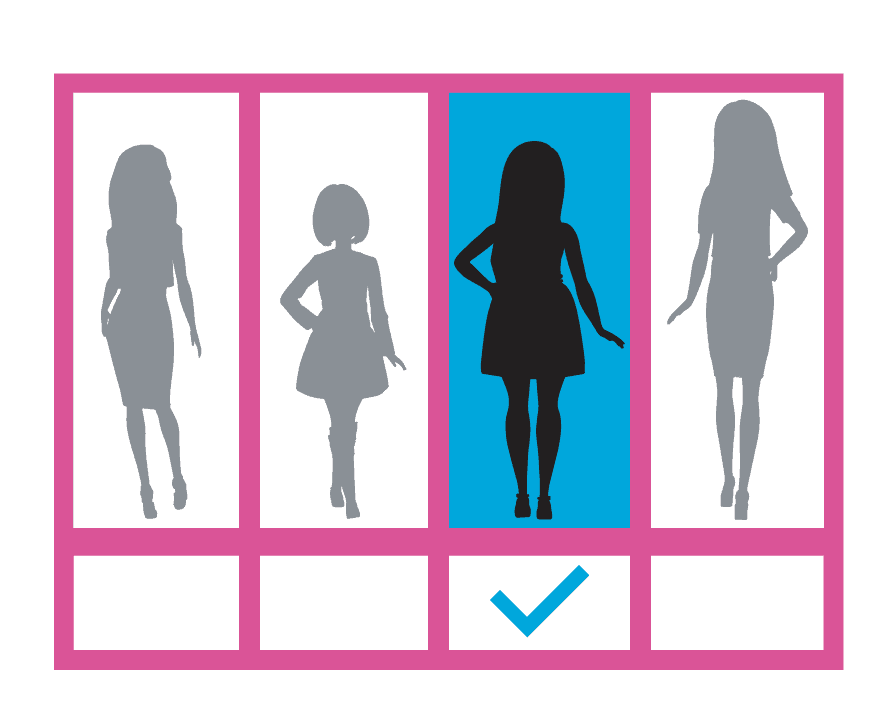
Then we had the challenge of body shapes. Everyone was easy except the curvy doll. Lots of opinions, lots of research on what was inclusive and relevant at the time. The word curvy was trendy at the time, still fashionable, and felt right. Then how do you show that with no words for multi-language packages? Illustrations of course!
I took on that challenge to putting something clean and easy to understand with the two graphics you see above.
After the launch, to make things more efficient for production, we decided to make all the dolls eventually have only a few background options, this saved a lot of money and time trying to matrix everything properly.
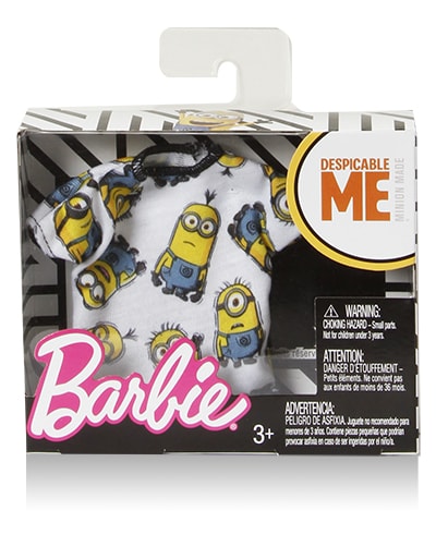
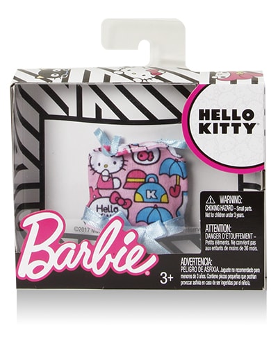
The line also was applied to the fashion packs and with licensed fashion packs, I am so grateful for a clean look when you have a pink Barbie logo, yellow Minions, red Hello Kitty, etc.
The look was so successful that the brand even now still uses the black and white backgrounds in bold shapes and still numbers the dolls for collectibility.
The PR crew was top-notch and it was mesmerizing to watch them manage a big brand re-launch in real-time.
You can go bold and make a change if you are passionate about something, all stick together, communicate often and know something is right for a brand. All the parts and pieces went very well for such a big project. It took a village and we all worked so well together to make it a success.
Again, I felt humbled to be a part of such a great team and another significant brand shift in her history.