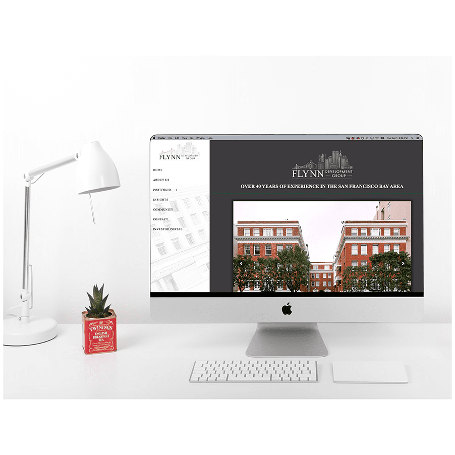
A commercial real estate investment company was in need of a new logo. It quickly became a full rebrand and website redesign.
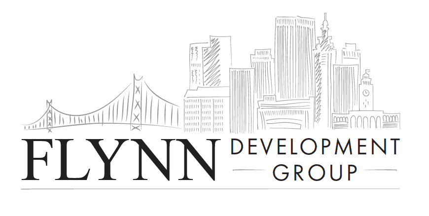
I was tasked with redesigning a logo as they were not happy with the current designs being created for them. I worked with the full team including the owner, Dennis Flynn, to listen and give them exactly what they wanted.
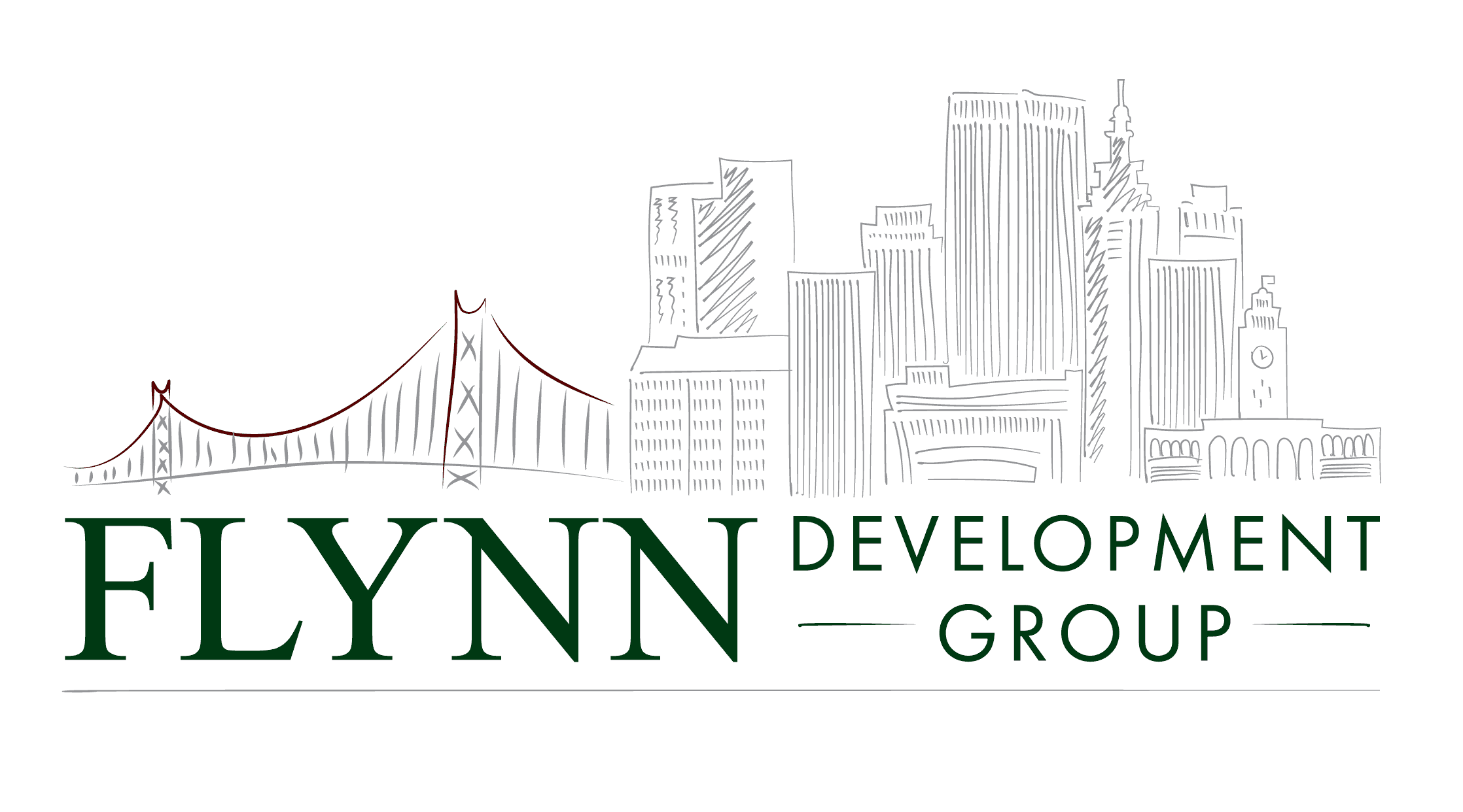
As a result, the logo was a hand drawn architectural skyline of San Francisco.
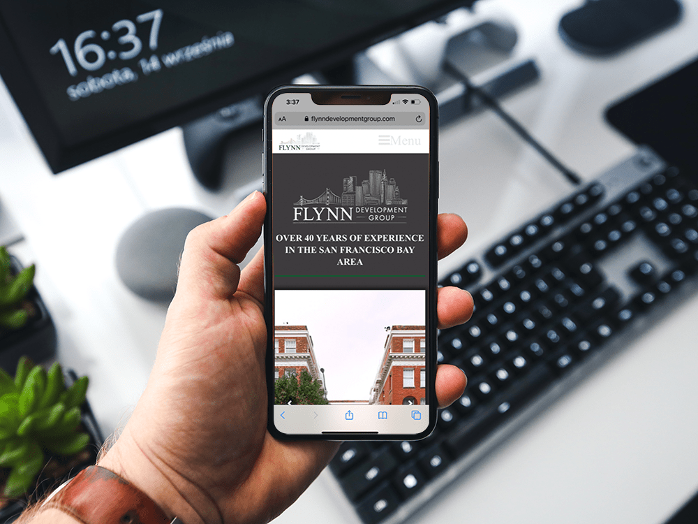
The final collateral and web designs came to life because of a solid brand base.
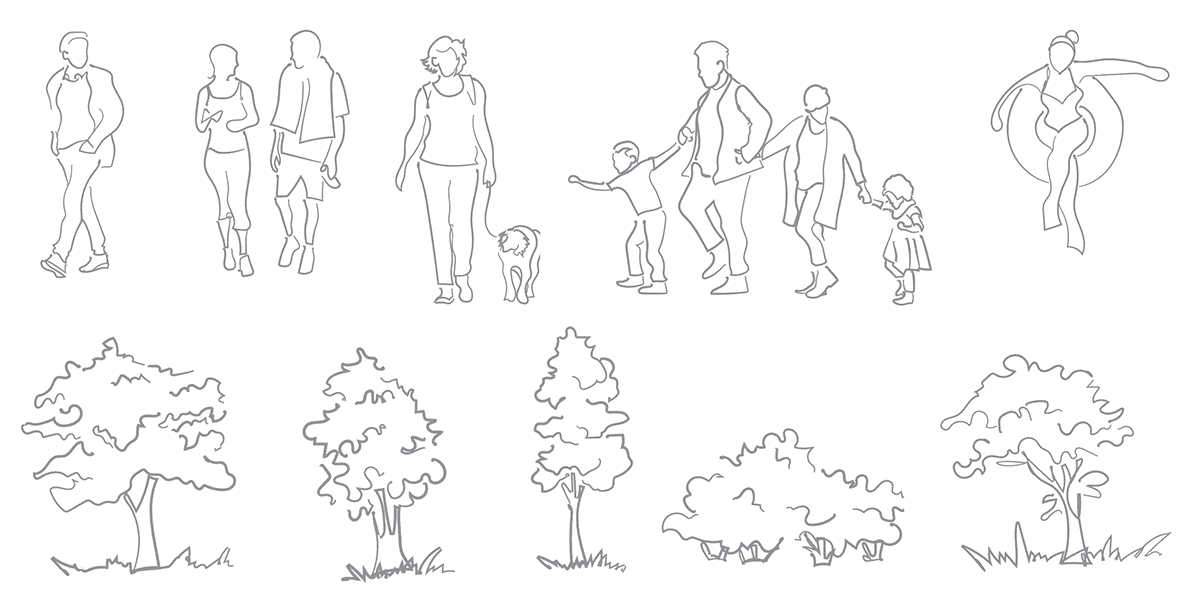
We extended the hand drawn look in to other parts of the brand such as the illustrations used on the website.
I worked with the IT team to create portal headers so to keep brand consistency.
As the brand came to life, we added employee extras like shirts, pens, and notepads.
Because of investor updates, the team was trying to get everything ready for the next investor call. The look is conservative enough for this type of company but also playful and different from everything else you see out there for real estate investment companies.
This project was my very first website I designed outside of my own personal site. I learned a lot and was appreciative that they let me design the site. I have learned a lot in the last few years and I would love to go back and redo the site to be more engaging and dynamic. Every website design is a new learning experience.
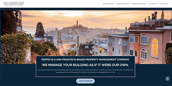
After this project was finished they referred me to others and was able to work with a few other companies like the one below to redo a law office website after a company name change and for a management company that needed a website refresh.